|
|


|
|||||||||
|
|
|
|
||||||
|
|
|||||||||
|
|
  |
 10 Jun 2006, 04:30 PM 10 Jun 2006, 04:30 PM
Post
#1
|
|
|
No comments Group: Admin Posts: 31720 Joined: 8-July 05 Member No.: 121 Zodiac Sign:  Gender:  |
2006 FIFA World Cup Logo 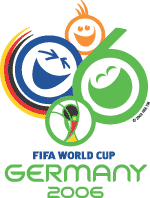 The 2006 FIFA World Cup logo was unveiled on 19 Nov 2002. The logo depicts three laughing faces in yellow, blue and green forming the symbol '006' and inviting the world to a party for the next World Cup. The slogan in English translates as 'Friends invite the world' (Die Welt zu Gast bei Freunden). According to World Cup organizing committee president Franz Beckenbauer the logo should be referred to as 'the celebrating faces of football' and aims to convey the message that Germany will be a welcoming and friendly host. 'We believe that the new emblem perfectly expresses our philosophy of having a buoyant, cheerful and carefree tournament in 2006," the former German coach and playing legend added. 'Everybody knows that we're good at organising but we wanted to convey an other, warmer and friendlier image of Germany.' "Everybody instantly recognises the Olympic Rings, the five intertwined circles representing the five continents. Without question one of the best-known logos in the world, the rings have been synonymous with the Olympic Games for decades. The logo is a crucial part of a major sporting event. It should be instantly recognisable, appearing as it does on all publications, at associated events and on merchandising. Before the event itself even kicks off, the logo is the bridge between the organisers and the public. Which all goes to explain why it was so important to give the agencies commissioned to design the logo for the 2006 FIFA World Cup�?� Germany a clear brief for the design. An exhaustive list of criteria was drawn up before they set about their work; as the host nation, Germany had to be instantly recognisable in the logo, as did the light-hearted and relaxed character of the 2006 tournament. It had to be unconventional, without being technocratic, and in keeping with the brand image of FIFA. As the event's organiser, FIFA commissioned London agency Whitestone to produce the logo. The decision to appoint Whitestone was based on their previous, outstanding design for the FIFA World Cup Korea/Japan�?� logo. Some elements of this creation, in particular the cup, are apparent in the 2006 logo - and will reappear in all future logos of FIFA World Cups. "We wanted to whet the appetite for what will hopefully be an upbeat FIFA World Cup", explained Andreas Abold, proprietor of abold, the agency commissioned by the OC to work alongside their London counterparts on the design of the logo: "Our goal was to convey, via a symbol, the incomparable emotions that can only be evoked by football. After numerous preliminary discussions, the creative minds of the two agencies got together in private for three days in -September 2001. Paper flew as sketches and ideas ranging from "the conventional to the extraordinary" were proposed and rejected. Dozens of meetings followed: in the Munich headquarters of the Germany OC, at Whitestone's offices in London and at FIFA in Zurich. There were discussions, deliberations and sometimes arguments. The end result was "Celebrating Faces Of Football". " --------------------  |
 |
 Bookmark this: Bookmark this:  
|
|

|
Lo-Fi Version | Time is now: 22nd June 2025 - 02:11 PM |
| Skin and Graphics by Dan Ellis and Anubis. Hosting by Forums & More � 2005-2011. |


